Some of the very basic and commonly used plots for data are:
Bar and Column Charts
Histograms and Frequency Distributions
Scatter Plots (if there is more than one quant variable) and
2D Hexbins Plots and 2D Frequency Distributions (horrors!!)
How do these Work?
Histograms are best to show the distribution of raw quantitative data, by displaying the number of values that fall within defined ranges, often called buckets or bins.
Although histograms may look similar to bar/column charts, the two are different. First, histograms show continuous data, and usually you can adjust the bucket ranges to explore frequency patterns. For example, you can shift histogram buckets from 0-1, 1-2, 2-3, etc. to 0-2, 2-4, etc.
By contrast, bar/column charts show categorical data, such as the number of apples, bananas, carrots, etc. Second, histograms do not usually show spaces between buckets because these are continuous values, while column charts show spaces to separate each category.
Bar and Column Charts in RAWgraphs
Dataset: Netflix Original Series
Here is a look at this data. It is readily available as on the in-bult datasets at RAWgraphs.
Examine the Data
name
class
levels
n
missing
distribution
Genere
character
10
109
0
Family Animation (29.4%) ...
Title
character
109
109
0
0.03 (0.9%), 13 Reasons Why (0.9%) ...
Subgenre
character
42
109
0
Animation (30.3%), Comedy (7.3%) ...
Status
character
4
106
3
Pending (41.5%), Renewed (34.9%) ...
name
class
min
Q1
median
Q3
max
mean
sd
n
missing
Premiere_Year
numeric
2013
2015
2016
2016
2017
2015.697248
1.101384
109
0
Seasons
numeric
1
1
1
2
5
1.642202
1.041037
109
0
Episodes
numeric
3
8
13
21
90
17.871560
15.671454
109
0
IMDB_Rating
numeric
0
70
77
84
96
73.559633
16.966978
109
0
NoteQuantitative Data
Premiere_Year: Year the movie premiered
Seasons: No. of Seasons
Episodes: No. of Episodes
IMDB_Rating: IMDB Rating!!
NoteQualitative Data
Genere: 10 types of Genres
Title: 109 titles
Subgenre: 42 types of sub-Genres
Status: 4 levels, status on Netflix
Research Questions
Let’s try a few questions and see if they are answerable with Bar Charts. Recall that Bar Charts show counts of Qualitative variables!
Q1. How many movies of each Genere? Sort them by Genere! Q2. Which Genere has the highest average IMDB_Rating? Some grouping + aggregating needed here!
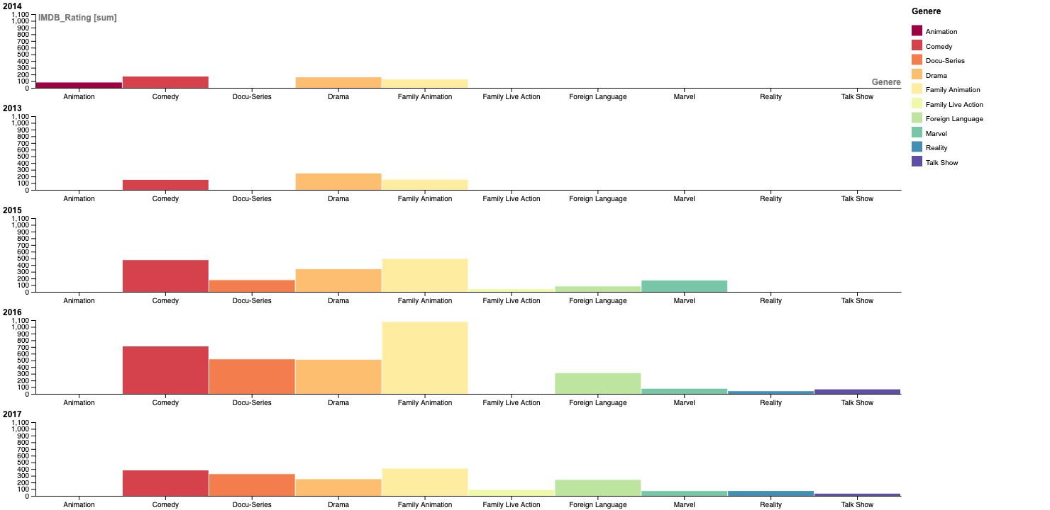
Plotting a Bar Chart
Let us create this figure:
What is the Story Here?
Talk Shows?? What??
Dataset: Banned Books in the USA
Here is a dataset from Jeremy Singer-Vine’s blog, Data Is Plural. This is a list of all books banned in schools across the US.
Download this data to your machine and use it on RAWGraphs.
What is the Story Here?
Frequency Distributions
2D Frequency Distributions and Hexbin plots
What is the Story here?
TBD
An Example: Frequency Density
How does this work?
Let us listen to the late great Hans Rosling from the Gapminder Project, which aims at telling stories of the world with data, to remove systemic biases about poverty, income and gender related issues.
TBD. Add 2D contour plots and link up to hexbin plots.
What is the Story here?
Your Turn
Rbnb Price Data on the French Riviera:
Apartment price vs ground living area:
(Try a Scatter Plot too, since we have two Quant variables)
Rbnb Price Data on the French Riviera:
India
Old Faithful Data
Income data
Diamonds Data from R
calmcode.io dataset
Fun Stuff
See the scrolly animation for a histogram at this website: Exploring Histograms, an essay by Aran Lunzer and Amelia McNamarahttps://tinlizzie.org/histograms/?s=09